导图社区 第一章:社会主义基本经济制度
第一章:社会主义基本经济制度
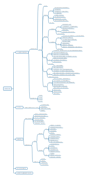
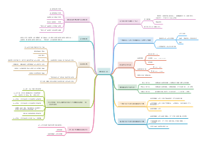
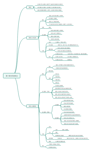
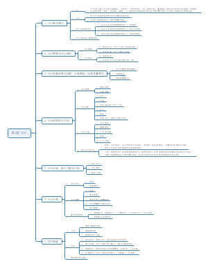
这是一篇关于第一章:社会主义基本经济制度的思维导图,主要内容包括:社会主义收入分配制度,社会主义所有制结构,社会主义基本经济制度的内涵。
编辑于2024-05-17 17:03:48- 2024中级经济师
- 相似推荐
- 大纲
导图社区 第一章:社会主义基本经济制度
这是一篇关于第一章:社会主义基本经济制度的思维导图,主要内容包括:社会主义收入分配制度,社会主义所有制结构,社会主义基本经济制度的内涵。
编辑于2024-05-17 17:03:48